Responsive Web Design Best Practices for 2025
Learn the latest responsive design techniques and mobile-first strategies that will make your website shine on every device in 2024.

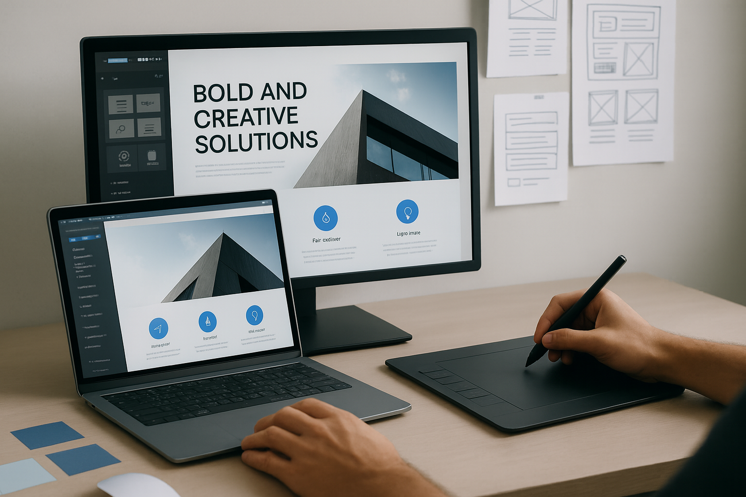
responsive web design Best Practices for 2025
In today's digital landscape, Responsive Design is no longer optional—it's essential. With mobile traffic accounting for over 50% of web usage, ensuring your website provides an optimal experience across all devices is crucial for success.
What is Responsive Design?
Responsive Design is a web development approach that creates dynamic changes to the appearance of a website, depending on the screen size and orientation of the device being used to view it. This approach uses flexible layouts, images, and cascading style sheet media queries.
Key Principles for 2025
1. Mobile-First Approach
Start designing for mobile devices first, then progressively enhance for larger screens. This Mobile-First strategy ensures your core content and functionality work perfectly on smaller screens.
2. Flexible Grid Systems
Use CSS Grid and Flexbox to create layouts that adapt seamlessly to different screen sizes. These modern CSS technologies provide more control and flexibility than traditional float-based layouts.
3. Optimized Images
Implement responsive images using the srcset attribute and modern image formats like WebP. This improves performance while maintaining visual quality across devices.
Implementation Tips
- Use relative units (rem, em, %) instead of fixed pixels
- Implement touch-friendly UI/UX elements with adequate spacing
- Test across multiple devices and browsers
- Optimize for accessibility with proper contrast and font sizes
Conclusion
Responsive Design continues to evolve, but the core principles remain the same: create flexible, user-centered experiences that work everywhere. By following these best practices, you'll ensure your website delivers exceptional user experience across all devices.
Ready to Transform Your Digital Presence?
Let's discuss how we can help capture the essence of your business through exceptional web design and development.